pr0nunciation: ü-'tE-nE interjection
1. a shout/expression used by Jawas on Tatooine during quick pans
2. a shoddy, not-often-updated blog that uses a (slightly altered) default template
Thursday, November 1, 2007
Friday, October 5, 2007
Thursday, August 30, 2007
Sneak Attack!
Friday, August 24, 2007
Tuesday, August 14, 2007
Tuesday, July 24, 2007
Thursday, June 28, 2007
Wednesday, June 27, 2007
Archiving Awesomeness
I'm doing some cleanup of the #MMC topic on IRC and I'd like to save this bit o' awesometimes.
GASOLEEN ON TEH RADIO!
http://www.wedg.com/snraudio/040307hour3.mp3
We're about 2:25 in.
GASOLEEN ON TEH RADIO!
http://www.wedg.com/snraudio/040307hour3.mp3
We're about 2:25 in.
Thursday, June 21, 2007
Thursday, June 14, 2007
MooseStock
Wednesday, June 13, 2007
Henchmen: Part Deux
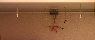
 I saw the "OVERNIGHT GROUND FORCE SYSTEMS" truck again yesterday, southbound on W. Henrietta just like last time. I managed to get along side it and snapped this picture (while driving, ftw).
 By the way, it's "Your Overnight Ground Force," not anyone else's.
Just in case you were confused.
Before, I might have thought it was at least a little clandestine in advertising what the company/ground forces is/are... but popping a big ol' phone number on the side of the truck doesn't really whisper "subtlety" to me as much as it seems to scream "HIRE YOUR THUGS HERE, MR. GOLDFINGER!"
Anyone feel like calling the number and helping unravel this mysterious truck of mystery?
Friday, June 8, 2007
Thursday, June 7, 2007
I got moved.
So yeah, I got moved.
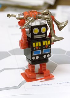
No longer in my own office, it's kind of sadtimes. I'm in a cubicle, next to the door in a small room full of cubicles. They say it's only supposed to be for "a couple weeks", but knowing the rate that construction has been proceeding around here, I won't be surprised if "a couple weeks" turns into "a whole bunch of weeks".
Robotman doesn't look like he's having a particularly good time either. Go easy on him, he just found out who his father is.
Tuesday, June 5, 2007
Sodus Adventures
So this weekend we had some adventures in Sodus. We doggy-sat for Amy's parents, and it became readily apparent that, after being used to living in the city, there's not a whole lot to do in Sodus. So we went to the thriving metropolis that is Sodus Point, drove around the "loop," ate dinner, and sat by the lighthouse.

 On the way back from Sodus Point, we passed a firehall and I couldn't help but laughing at this sign... only in the country, man. The other side to which it refers, was almost as funny... saying "POT OF GOLD - SOLD OUT". Now, I imagine that it refers to a "pot luck" dinner, which, for the uninformed, is a gathering where everyone brings a dish to pass, and people eat buffet-style. But it begs the question - how can a pot luck dinner be sold out?
 Now, I'm not saying that graffiti is an unusual thing in and of itself, but I suppose I'm used to tags and more decorative work, especially on train cars. But apparently some fine chap decided it was entirely necessary to label this unfortunate hopper car for what it is.
 A casual passerby in Sodus might not notice this in passing, but I suppose I'm not a casual Soduskan. I guess I wasn't aware of where people kept their 1800's-era steam-powered tractors and 1960's-era stovetops... which is next to their dilapidated barn, as I've come to understand.
 These people are really taking the stereotypical redneck "old vehicle rusting in the front lawn" to a new extreme. +100 redness to the neck!
Wednesday, May 30, 2007
Tuesday, May 22, 2007
Thursday, May 17, 2007
This comic pretty much sums up my life.

Comic from xkcd
And all this time, I thought I was the only one who had this particular neurosis.
And all this time, I thought I was the only one who had this particular neurosis.
Wednesday, May 16, 2007
I weep for the future... of graphic design.
 Fig. 1 - My original
So yesterday I was told that I had to do four posters for a trade show. Okay, not a big deal. Then they told me that they had to be completed enough for review by about noon. Okay, yikes, not usually my preferred timeframe... but I'm a tough dude, I can whip something out.
So after my first attempt was unceremoniously shot down (for apparently not being eye-catching) I tried something a little bolder (see fig.1) as the basis for the four posters. "A big, bold background and bright text! That'll knock 'em dead!," I thought to myself. Seeing as the top heading cried out "big money!" to me, I went with fonts similar to what's on American paper money. This went over well, and they agreed to use it. No big problems thus far. Pretty proud of my bold (albeit rushed) design.
Then today, my boss tells me that the head boss called for a few changes at the (even more) last minute, and for time's sake she (my boss) would be the one to implement them. Fine, fine... this is usually nothing big. However, after I saw the final version, I may be decidedly more wary of "a few changes" in the future. To say that "I'm not entirely pleased with the final version that was decided upon by the higher-ups" would be a bit of an understatement. (see fig.2)
Monday, May 14, 2007
Me & Artoo
Thursday, May 10, 2007
son of a beach
 I'm not really sure what happened here... I started doodling while making a disk image of a dvd at work, and it turned into something resembling one of the final scenes of Spiderman 3 - where the "Sandman" has assimilated dumptrucks worth of sand, has become humongous, and is holding off anyone who comes near, to allow Eddie/Venom to set a trap for Spiderman.
 Man, even just describing it sounds super-geeky.
Anyway, I know the proportions/lighting/everything is kinda messy and whatnot, but it was fun to draw. w00t.
Oh and Monroe Litho, you can rest assured that the free notepad you gave me has finally come to good use.
Tuesday, May 1, 2007
harrypotterharrypotterharrypotterrrrr
 I was looking at acciobrain and got inspired to try my hand at some Harry Potter character sketches. This one's Harry (obvious)...
 ...Aaaand here's Snape.
 I did these with pencil/pen on post-it notes, but got a little carried away in Photoshop. Clicky for bigger look'ns.
Thursday, April 19, 2007
Let the Good Times Roll
So Matty and Seth had a great time with this Brit kid yesterday.
Check it out here.
Check it out here.
Monday, April 16, 2007
windowpaintsplosion
Having a secret cat is a tricky business. You've got to be sly about carrying in cat food and litter, gotta know when maintenance men are coming into your apartment to fix something (ha! as if they'd fix anything on their own) and, if your apartment windows are at ground level, you've gotta disguise the cat sitting there. Because, obviously, cats want to sit in windows. And watch things. And make strange little guttural noises at birds.
So this paintjob was a clever way to hide the bright white cat that would otherwise be seen by every passing car in the guest parking lot, which is right outside. This pic was taken at night, so the top is actually just the clear glass, not black, and the bottom leftmost circle of the right pane is also clear... just the size of a kitty face.
So this paintjob was a clever way to hide the bright white cat that would otherwise be seen by every passing car in the guest parking lot, which is right outside. This pic was taken at night, so the top is actually just the clear glass, not black, and the bottom leftmost circle of the right pane is also clear... just the size of a kitty face.
Tuesday, April 10, 2007
Crikey.
 So this is the sign for the next trade show, with a "crocodile hunter" theme. I was given a pink post-it note with the text, and was told the theme... I was thinking about possibly a cartoony version of Steve Irwin, but thought that'd be a little tacky, seeing as he's um... kinda... dead :P I found out that Jackie from marketing would be dressing up in the famous khaki outfit for the show, so I got the go-ahead to make a cartoony version of her instead.
This is my idea sheet with sketches of how things could look:

Then I went ahead drawing out Jackie in croc-hunter garb:

Photoshop geekiness follows:
For this type of cartoon (like the TMNT Steve-o) I've pretty much got my method down now - I start with a pencil sketch, ink it over and scan it (1st version pictured), then clean it up in Photoshop and get rid of errant lines (2nd version). I add coloring beneath the linework, making separate layers for each article of clothing, skin and hair (3rd version). I then use adjustment layers (set to hue/saturation) for the shadows and highlights on each layer, drawing within the layer mask to control where the shadow/highlight will go. I like this adjustment layer method, because it leaves room for tweaking later on... after it inevitably looks different on the first printed proof.
The rest of the final sign/poster was done with Illustrator, popping a traced "jungle" photo in the background, then a couple of starbursts and a radial gradient for a vignette type effect.
I basically stole the style of the "crikey" text from TMNT Steve-o, but hey... maybe that's justification for drawing it at work in the first place? Works for me.
Wednesday, April 4, 2007
Neon + on + on + on
 So my company goes to trade shows with big themes for their booth, and the next show they're having a "Vegas Wedding" theme. Don't ask me how a Vegas wedding and sterilization products fit together, because I don't know either... I just make the artwork.
So anyway, I thought it'd be cool to try to mimic the signs of Vegas wedding chapels, with their neon and multitudes of lightbulbs. I'm pretty proud of the neon effects, especially on the "world famous" words. Do broken lightbulbs and the dimmed-out "d" in "wedding" add a bit of cheesy realism? I like to think so.
Needless to say, this will end up being changed in some way, shape or form by the marketing peeps... but I like this version, so I'm posting it before I have to change it.
UPDATE: Needless to say, they wanted changes. They asked for the word "medical" to be in lower case, so I adjusted the sizing and redid all the lightbulbs.

Friday, March 23, 2007
Steve-o In A Half Shell!
 Suddenly, Steve-o found himself feeling queasy, and a bit tingly all over. "Is it possible that my one and only wish really came true?!?" he thought to himself, then turned to the mirror and saw that he had, indeed, become a mutant turtle.
 So Steve-o told me to make him a fanboy-esque drawing of him as a Teenage Mutant Ninja Turtle. There ya go, Steve-o... you owe me a coke.
Thursday, March 8, 2007
Tuesday, February 13, 2007
Logo

Here's my as yet apparently unsatisfactory logo for the Greater Rochester & Finger Lakes Central Services Association. "Can you like, squish the letters together more, maybe?"
No. No I can't.
UPDATE: I added the Rochester skyline to the logo. It was in my original sketches, but I decided to simplify it and leave it out. "Thoreau said 'Simplify, simplify.'" Then the client responded to my design by asking if I could put in "a group of sky scrappers [sic] in the back ground representing Rochester." So there you go... sky scrappers.
UPDATE AGAIN: The final version of the logo is somewhat of a comprimise - the letters are squished together, but the surrounding rectangles aren't squished as much as some of the versions that they asked for... so it's not too shabby after all. I also increased the size of the rochester skyline and fixed the black to be darker. Here's the final in color and in the black and white variety:


Tuesday, January 23, 2007
Wednesday, January 10, 2007
Subscribe to:
Comments (Atom)


